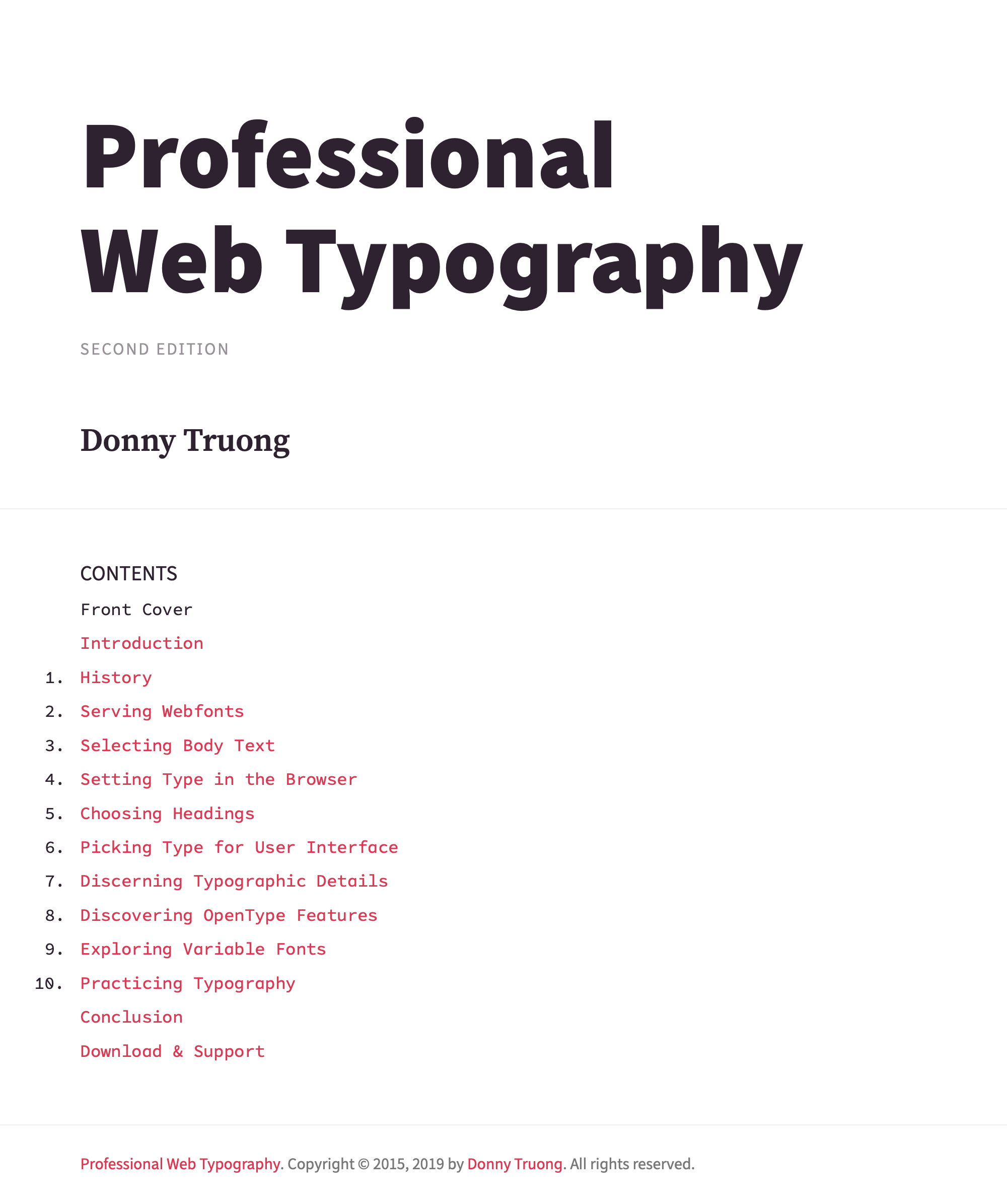
Practicing Typography
Up to this point, you have learned the foundation of selecting body text, setting paragraphs, choosing headings, picking UI type, and applying typographic details. You have gained CSS skills to style your fonts. In this last chapter, I would like to leave you with some practical demos to expand on what we have covered. I encourage you to download them, view their source (HTML and CSS), modify them to practice your web typography, and adapt them in your own projects. But before we delve into the demos, which used grid extensively, I would like to go over the essential properties of CSS Grid.
Using Grids
Grids are systematic layouts made of columns and rows. They play a crucial role in organizing information and maintaining consistency throughout a composition. One of the major benefits of grid-based design is typographic control. Although grids have been used in print design for many decades, they only become available on the web in recent years with the support of CSS Grid, which landed in major browsers in early 2017.
Defining a Grid
To declare a grid in CSS, use the display:grid property on the parent element. Then apply grid-template-columns to define the regions and grid-gap to specify the space of the gutters. For example:
.grid {
  display: grid;
  grid-template-columns: 2fr 1fr;
  grid-gap: 1em;
}
Now you can add a grid class in your markup:
<body class="grid">
  <main></main>
  <aside></aside>
</body>
In the markup above, body is the parent element. main and aside are the direct children; therefore, they become grid regions. Defined in grid-template-columns, main takes up 2fr units and aside takes up 1fr unit. grid-gap (gutter) takes up 1em.
The “fr” Unit
CSS Grid introduces the new fr unit, which represents fraction, to provide flexible grid layouts. Unlike a print layout, which defines rigid columns, the web needs fluidity; therefore, fr allows columns to adapt to the available space of the parent element. The fr unit is designed specifically with the principles of responsive design. As a result, making responsive grid for the web is as easy as defining the fr unit in the grid-template-columns element. However, what I find misleading about the fr unit is that it doesn’t take grid-gap into account. For example:
grid-template-columns: 2fr 1fr;
grid-gap: 1em;
In the CSS above, the 2fr unit does not include a 1em gutter in between the two regions. As a result, you will end up with an inconsistent grid: 1fr 1fr 1em 1fr (region region gutter region). A consistent grid should follow: 1fr 1em 1fr 1em 1fr (region gutter region gutter region).
The “span” Keyword
To create a consistent grid, you need to use the span keyword to specify a grid item’s size and location within the grid-column property. For example:
.grid {
  display: grid;
  grid-template-columns: 1fr 1fr 1fr;
  grid-gap: 1em;
}

main {
  grid-column: span 2;
}
Instead of defining the main area as 2fr, you break it down to 1fr and 1fr, then use the grid-column property to join them together: span 2. Let’s take a look at how these CSS properties work in the demos.
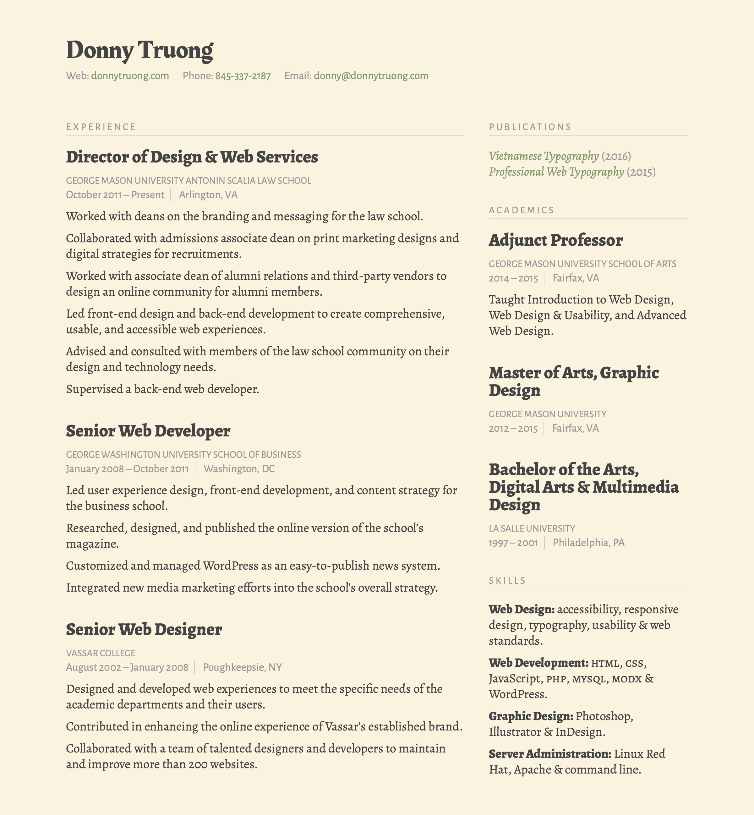
Online Résumé (Two Columns)
Designing an online résumé is a great way to practice your web typography. You have to consider readability, legibility, hierarchy, and harmony; therefore, you need to choose your type with care. I also suggest making the layout responsive to ensure your résumé will work on any device. In this demo, which is my actual résumé, the layout is one column on small screens and expanded to two columns on large screens. For the typefaces, I combined Alegreya and Alegreya Sans, designed by Juan Pablo del Peral for Huerta Tipográfica. For the header, I used Rakkas, designed by Zeynep Akay, for a bit more flare.
Here’s the markup:
<body class="grid">
  <main></main>
  <aside></aside>
</body>
Here’s the CSS:
.grid {
 display: grid;
 grid-template-columns: 2fr 1fr;
 grid-gap: 1em;
}
Online Résumé (Three Columns)
When applying for a job, you might want to customize your résumé to a specific hiring company. Thanks to the power and flexibility of CSS, you can recreate your résumé with a few tweaks. In this demo, I changed my résumé from a two-column to three-column layout. I also switched out the typefaces. In this version, I am combining DM Sans and DM Serif Display, designed by Colophon Foundry.
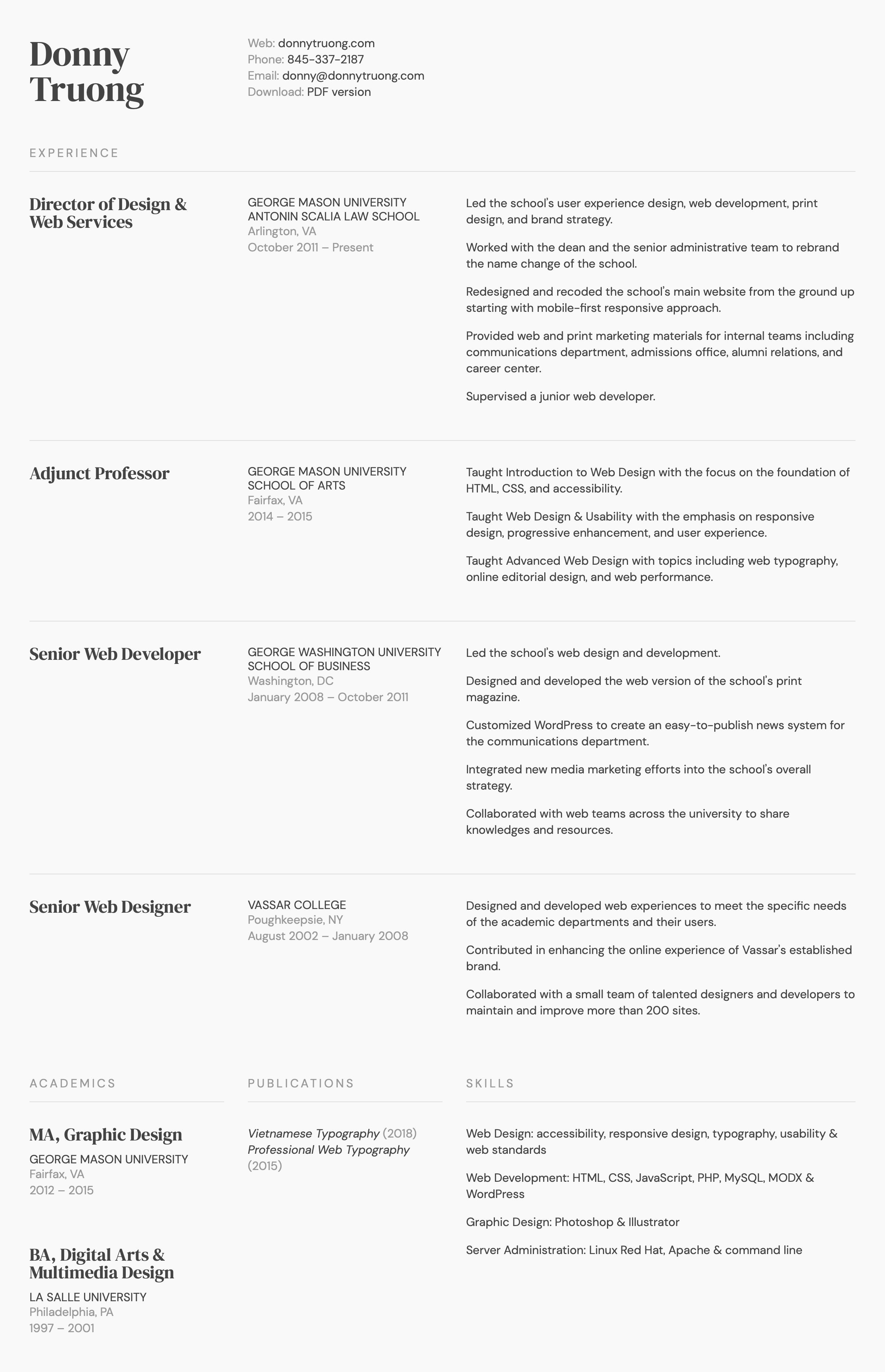
Here’s the CSS:
.grid {
 display: grid;
 grid-template-columns: 1fr 1fr 2fr;
 grid-gap: 1em;
}
Blog
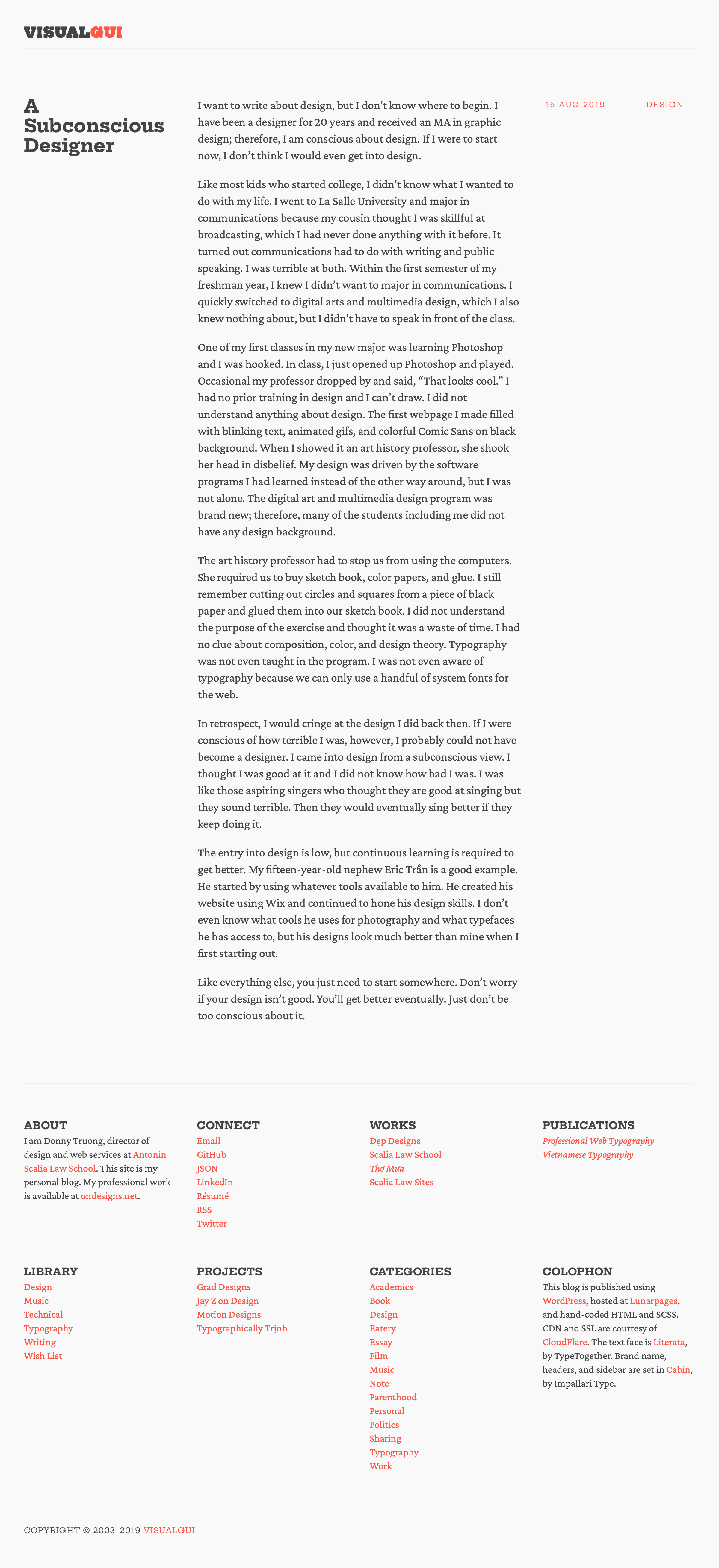
Visualgui is both my personal blog and typographic experimentation. Launched in 2003, I knew from the get-go that I wanted to focus my blog on text and nothing else. Powered by WordPress, I redesign it every few months to change up the grid layouts as well as the typefaces. It has evolved over the years, but my main focus had always been on typography. In this demo version, I set the main text in Crimson Pro, designed by Jacques Le Bailly. Heading and small text are set in Hepta Slab, a variable font designed by Mike LaGattuta.
For large screens, I want the headline to be on the left, the main text in the middle, and the date on the right. For my footer, I want each section to take up one column. Here’s the markup:
<article class="grid">
  <header></header>
  <div class="main-text"></div>
  <footer></footer>
</article>


<aside class="grid">
  <section></section>
  <section></section>
  <section></section>
  <section></section>
</aside>
Here’s the CSS:
.grid {
  display: grid;
  grid-template-columns: 1fr 1fr 1fr 1fr;
  grid-gap: 1em;
}

.main-text {
  grid-column: span 2;
}
As demonstrated above, I have to use the span keyword to make the main text align with the edge of the columns in the footer. If I simply define 1fr 2fr 1fr in the grid-template-columns, the 1em gutter won’t apply between the 2fr. As a result, the grid between the blog post and the footer columns will be off.
Online Editorial Design
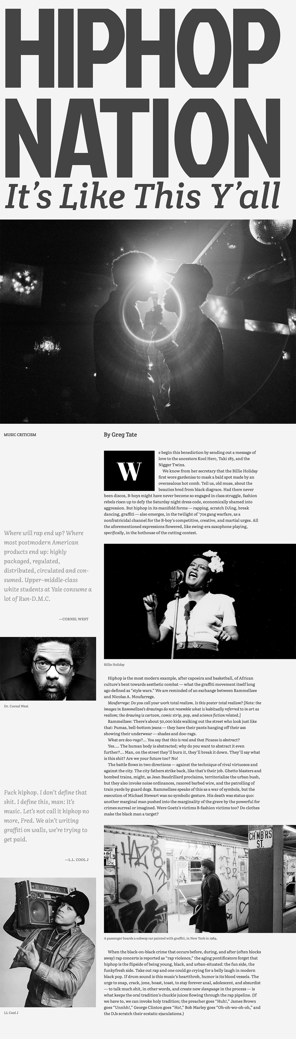
Editorial design is gaining momentum on the web as browsers continue to improve CSS support. The potential for crafting an enriching editorial experiences is promising; therefore, I encourage you to explore this space. For this demo, I am using a Greg Tate’s essay titled “Hiphip Nation: It’s Like This Y’all,” published in the Village Voice. Tate is one of my favorite music critics; therefore, it is such an honor for me to create this demo. The typefaces used are Jockey One, Crete Round, Literata, and Abril Fatface—all designed by TypeTogether.
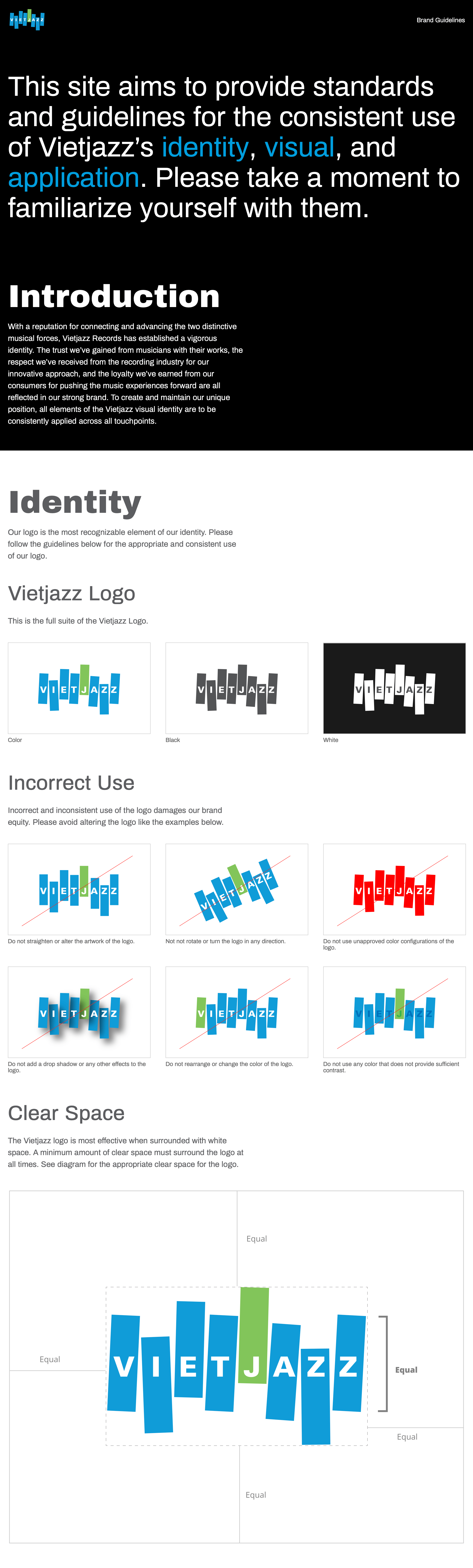
Branding Guidelines
Vietjazz is a record company I had dreamed up to connect and advance the two distinctive musical forces: Vietnamese ballad and jazz. As a jazz fan with Vietnamese music in my blood, I love the marriage between the two distinctive musical landscapes and want to explore more in this direction. In my informal research, what I have learned is that most Vietnamese listeners aren’t familiar with the jazz sound. My goal for Vietjazz Records is to produce and promote Vietnamese music with jazz flavors. From signing artists to album concepts to art direction to distribution, Vietjazz will be involved in every aspect of crafting an experience.
Although Vietjazz is a fictitious brand, it gives me an opportunity to design and develop the whole concept from identity to visual elements to applications. For the demo, I created a page to illustrate all the guidelines for the brand. I hope you will enjoy it and develop something similar for yourself or your company.
Web-based Book
After releasing this book and Vietnamese Typography, I received a handful of inquiries expressing interests in using the web as a publishing platform. As a result, I decided to share the source code for Professional Web Typography. In the demo, you will get the front cover, the introduction page, and the history page. These three pages and the complete CSS file will help you get started creating your own web-based book. Because this is a demo, I have to change the typefaces from commercial to open source. I chose Source Sans Pro, by Paul D. Hunt, Source Serif Pro, by Frank Grießhammer, and Source Serif Pro, also by Hunt. I hope this demo will inspire you to create your own web-based book and share with the world.